Loading...
Select Version
&pagelevel(3)&pagelevel
As the various user interface controls are often given different names, the terms used in this document are listed briefly below and described and/or illustrated.
- Button
Clicking on a button generally causes an action to be performed. The text on the button briefly describes what will happen when the button is clicked.
Example:
- Insertion point
The insertion point is not to be confused with the mouse pointer. It specifies the point at which you can enter text in edit boxes or text boxes. You can usually set the insertion point by clicking with the mouse. It appears, for example, as a blinking vertical line or an inverted blinking rectangle.
- Check box
Check boxes indicate options which can be activated or deactivated by clicking on the check box or associated text.
Example:
- Cursor (or mouse cursor)
The cursor indicates the current position of the mouse on the screen. If it is pointing at a specific object it may change its appearance. This generally means that a particular operation can be carried out by clicking or dragging with the mouse.
- Dropdown box
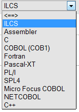
A dropdown box is basically a list box that is normally "closed". Only the entry that is currently selected in the picklist is visible. However, if you click on the down arrow or somewhere in the closed dropdown box, the entire picklist is displayed. Clicking on one of the entries in the picklist selects the item and closes the box again. Clicking on the arrow button again or pressing the Esc key will also close the box again.
Example: Closed dropdown box:
Opened dropdown box:
- Edit box
An edit box enables you to enter a value (number or text).
In general, values in the clipboard can also be pasted into an edit box, or selected values in an edit box can be copied to the clipboard.
Example:
- Property page
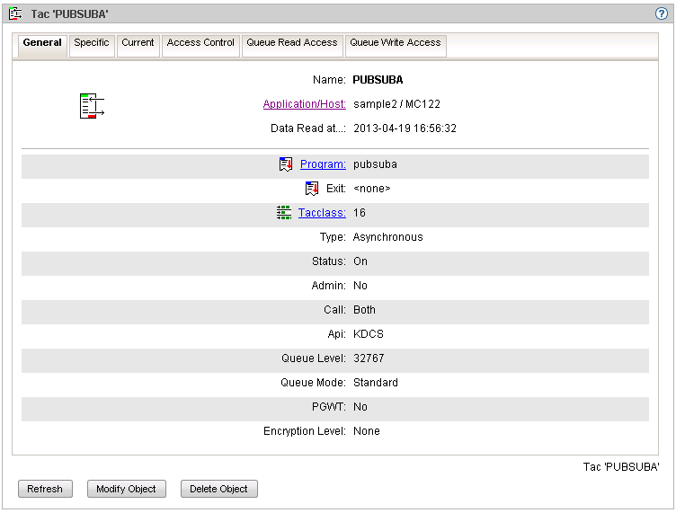
A property page generally allows you to view and to modify object properties. It consists of one or more sheets or pages that are arranged like tabs overlapping one another. Each individual sheet has a tab indicating the sheet's name. Only one sheet is fully visible at any given time. To view a sheet that is not fully visible, click on its tab. The sheet is then displayed (activated, foregrounded).
Below the sheets you will generally find the 'Refresh' and 'Modify Object' buttons, and sometimes also 'Delete Object'. There may also be other buttons for accessing object-specific functions.
Example:
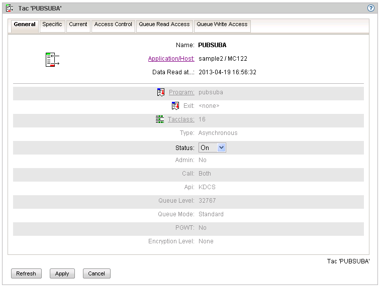
Clicking the 'Modify Object' button switches to the Edit mode in which all properties that can be edited are presented in text boxes or dropdown boxes.
Properties that cannot be edited are grayed out. The property page then looks something like this:
In Edit mode, only the 'Refresh', 'Apply' and 'Cancel' buttons appear.
Clicking the 'Cancel' button switches Edit mode off again. If you click the 'Apply' button, the changes you have made are saved. If saving is successful, Edit mode is exited. If saving is not successful, the reason will be indicated below the 'Apply' button.
Clicking the 'Refresh' button updates all the properties with the values specified for the object. Any changes you have made, but not yet saved, will be overwritten.
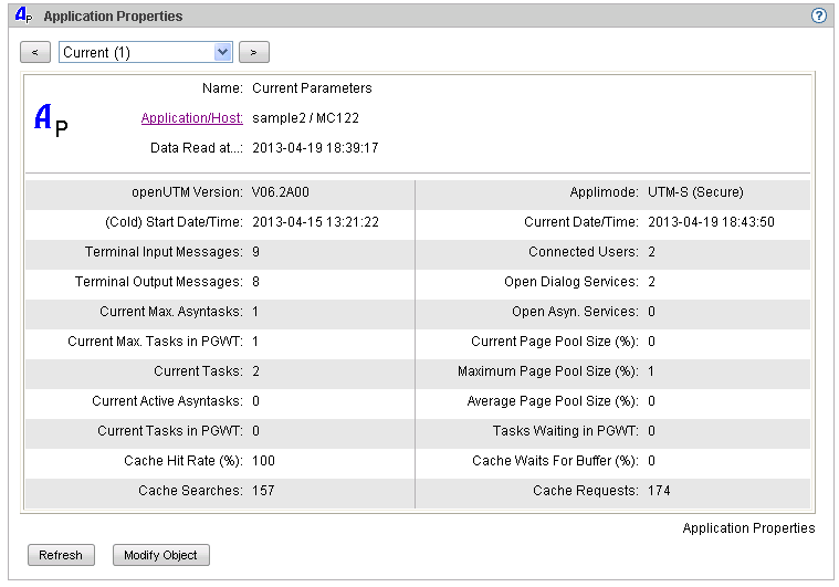
The tabs on the individual sheets may also be listed in a dropdown box. In WebAdmin this is the case for the property pages of UTM applications or UTM clusters:
- Property page section
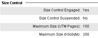
Controls that form a logical unit are grouped together in property page sections.
Example:
- Click (or mouse click)
This generally means pressing the left mouse key. If the right mouse key is to be pressed, this will be expressly mentioned. You click with the left mouse button, for example, to activate windows, select entries in lists, move the input focus to a control etc.
Clicking with the right mouse button (right-clicking) often opens the general context menu for the web browser, not a specific WebAdmin function.
Note: The function of the left and the right mouse keys can be swapped in the Windows Control Panel.
- Navigation bar (secondary navigation)
The navigation bar is displayed along the top of every page and indicates the position of the currently displayed page in the respective hierarchy. The currently displayed page is highlighted in color. Clicking on one of the other entries displays the page represented by this entry.
Example:
In this example, clicking on 'Ltacs' would display the object list with the Ltacs for the cluster 'UTM-Cluster 1', and clicking on 'UTM-Cluster 1' would display the primary page for the UTM cluster 'UTM-Cluster 1'.
- Object list page
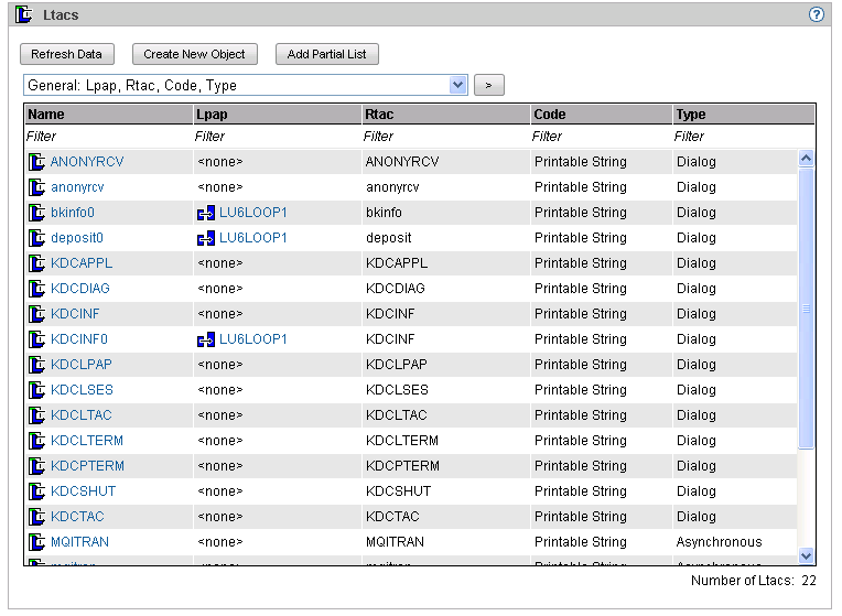
An object list page contains all the objects of a particular type in the form of a table.
Example:
- Radio button
There are generally at least two radio buttons. They allow you to select just one of several options offered and are often grouped together in one dialog section. If you click on a radio button (or on its text) in a group then that button is selected. Any previously selected radio button in the group is deselected (like the station keys on an old car radio: if one is pressed, the other pops out again).
Example:
- Scroll bar
You can use the scroll bar to change the displayed part of a long list, dropdown box, etc.
Example:
- Sidebar (primary navigation)
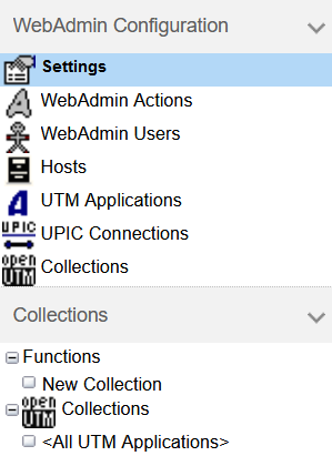
The sidebar is displayed down the left-hand side of every page and allows you to access certain objects and object functions.
Example:

